SsangYong Colombia, now branded “SsangYong es KGM,” sells SUVs and pickups across the country. Its website showcases the vehicle lineup, takes quote and test drive requests, and connects people with the dealer network, after-sales service, and the parts store.
🖌️ Figma
🖥️ WordPress
🏗️ Elementor
📊 Google Tag Manager
Project type
Web design
Role
UX/UI and web design
Outcome
Redesigned site live, with clear paths to quotes and test drives.
Forms integrated with the CRM and tracking with Google Tag Manager.
Ongoing site management and maintenance.
The challenge
Redesign the SsangYong Colombia website to make it more appealing, work on every device, and improve features like traffic tracking and form handling. The constraints:
Present a wide lineup of SUVs and pickups, each model with its spec sheet and safety features.
Serve different audiences: individual buyers, companies with fleets, and after-sales customers.
Turn visits into quote and test drive requests that reach the CRM.
Goal
Clear navigation and well-organized content so people can find information fast.
A smooth mobile experience.
A faster site that follows SEO best practices.
Forms integrated with the CRM and tracking with Google Tag Manager.
My role
I worked on the redesign as a web designer at Processoft, where I also manage and maintain the site:
UX/UI: design proposals in Figma.
Web design: building the pages in WordPress with Elementor.
Optimization: load speed, optimized images and assets, and SEO best practices.
Digital marketing: working with the marketing team on lead generation and tracking.
Key decisions
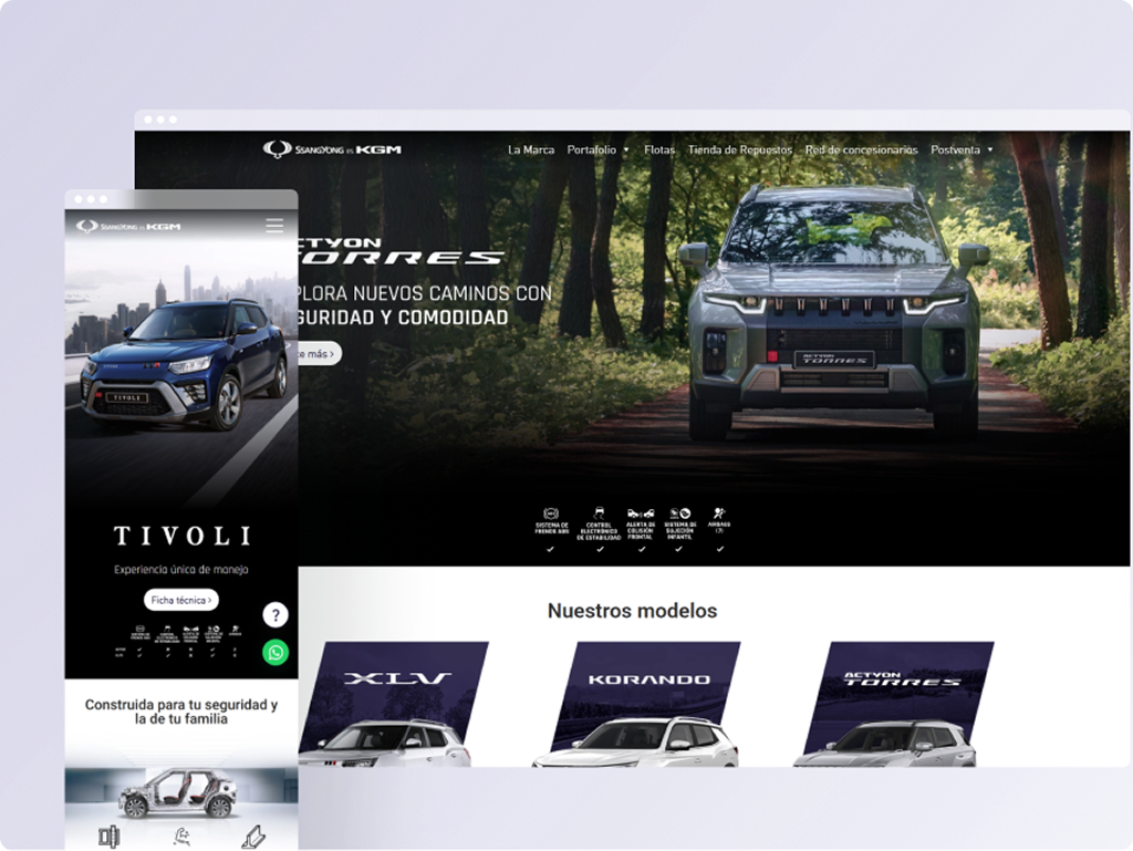
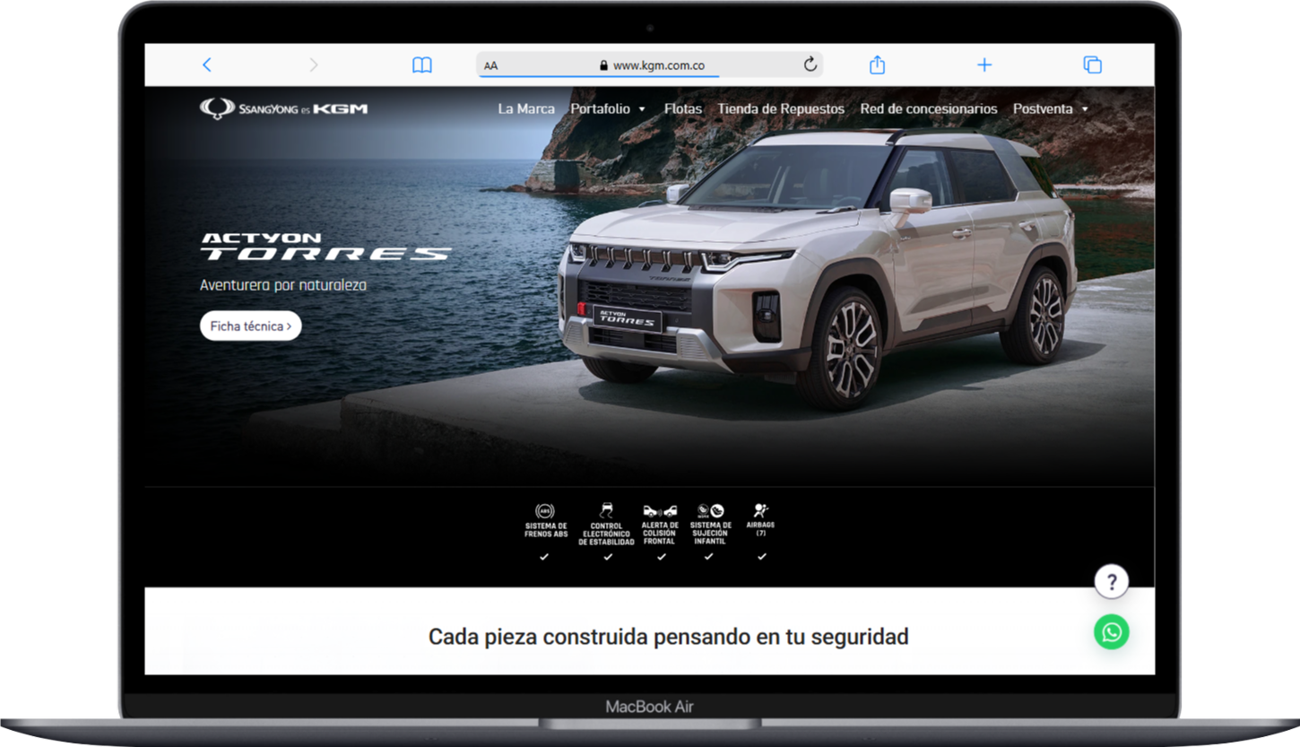
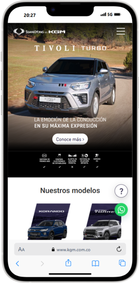
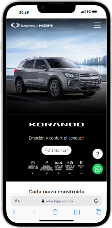
The vehicle takes center stage: each model opens with its photo, its tagline, and a link to the spec sheet, with safety features visible above the fold.
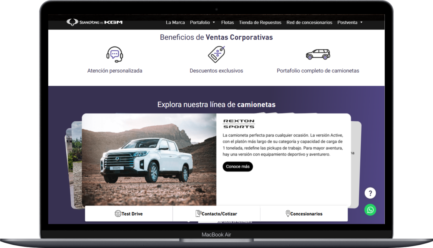
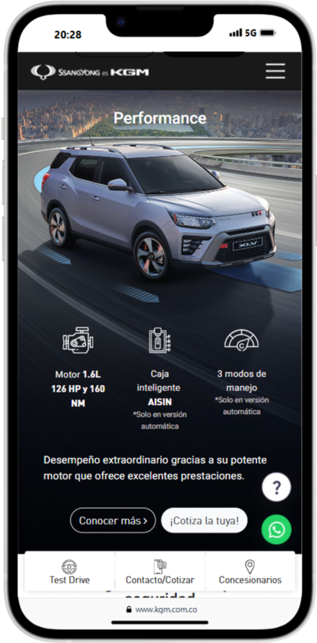
The next step is always within reach: a sticky bar with Test Drive, Contact/Quote, and Dealers, plus direct access to WhatsApp.
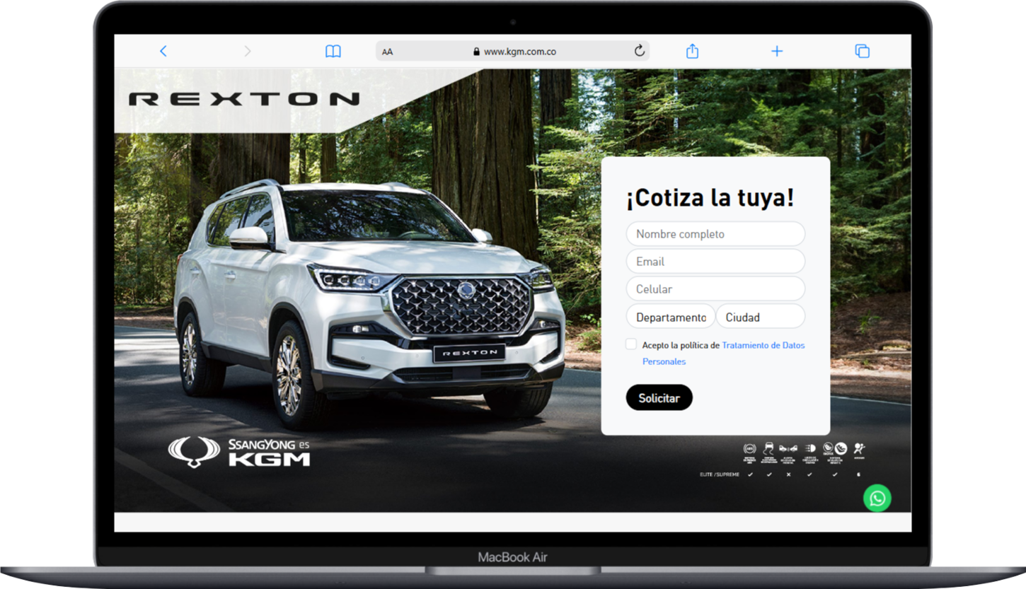
Short forms right next to the vehicle: on model landing pages, the “Get your quote!” form asks only for name, email, phone, and location.
A path for each audience: a fleet page with corporate sales benefits, plus quick access to after-sales and the parts store for existing customers.
Great photography without sacrificing speed: an image-heavy site needs optimized assets to load fast on mobile.
Solution
Home: featured models, safety features, and the “Our models” section.
Model pages: Actyon Torres, Rexton, Tivoli, and Korando, with specs, performance details, and calls to learn more or get a quote.
Quote landing page: a form right next to the vehicle, with consent to the data policy.
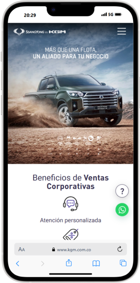
Fleets: corporate benefits (personalized service, exclusive discounts, and the full lineup) and a pickup carousel.
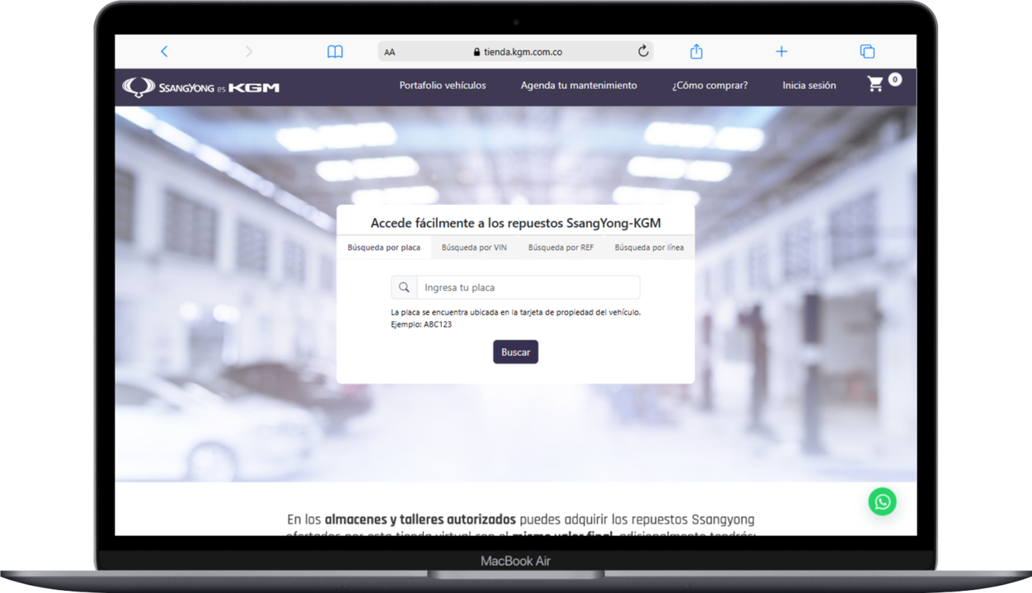
Parts: an online store with search by plate, VIN, part number, or model line.
Mobile: compact menu, sticky action bar, and WhatsApp.
Results
The redesigned site went live with clear paths to quotes and test drives, on desktop and mobile.
Forms were integrated with the CRM to automate vehicle requests.
Google Tag Manager tracking makes it possible to follow key events and make data-driven decisions.
The site keeps evolving: I manage and maintain it.
Lessons learned
On an automotive site, the vehicle sells: the visual hierarchy should let the photos and specs speak, with the next step always close by.
A site with several audiences (buyers, fleets, and after-sales) needs separate paths to keep navigation from getting crowded.
A site that launches models and campaigns often needs reusable blocks to build new landing pages without starting from scratch.
Key screens
Home page featuring the Actyon Torres, fleet page, parts store, and the Rexton quote landing page.
Responsive
On mobile: home page featuring the Tivoli Turbo, Tivoli XLV performance, the Korando page, and fleets.